Your cart is currently empty!
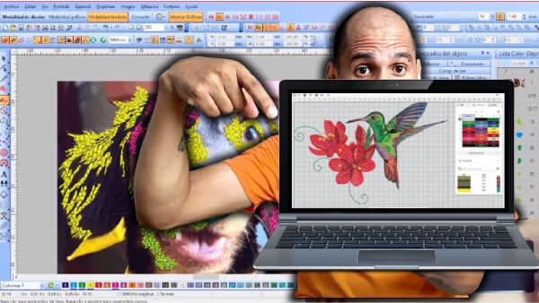
This is how a Pet Embroidery Design is made at WILCOM ES
Howdy I’m Johan, in this post I’m going to teach you how to create this embroidery design.
I recommend you watch the video because it is long, descriptive and dense. What you will find below the video is a transcription of what I show and teach you there. But my 100% recommendation is that you watch the video, English subtitles available.
We are going to create this design in the conventional way as we have already worked with a mouse and keyboard in the previous videos, but we are also going to use or I am going to teach you how to use a tablet and its respective stylus.
To be clear, we are going to work on it with a mouse and keyboard, but I am also going to show you how you can do it with this tool.
It is a tool that is very useful, it has made it easier and saved me a lot of work and right now with practice I work more comfortably with this than with a mouse and keyboard.
So let’s not waste any more time, let’s do the design.
The design we are going to make is this photo of a pet.
We are going to work on it so that it looks as realistic as possible.
So usually for this type of designs I use a tablet or an optical tablet like this one, which is quite simple and economical, but I can also do them without any problem with the mouse.
The tablet is because it gives me a certain ease and speed when doing it and since it is a job that occurs to me quite frequently, so I use it.
Okay so what I’m going to do is copy the image and here I have the program open, we’re going to open a new window.
I am not going to use the automatic wizard, I go to the graphics mode window to be able to paste the image here.
Okay, perfect, then once the image is pasted I’m going to cut the edges to give it the exact size.
If you have the problem that you are trying to cut the image and you see that it is going away, it is forced towards the edges of the photo, what we can do is in this tab where it says fit into objects, remove this check box.
So that’s where the cutting box is going to let us move freely, so we’re going to take it close to the edge and cut.
Suddenly here there are details in the left ear that are a little dark and hardly noticeable, I can go to the window, sorry, the effects/adjust tab, the brightness/contrast option, what I can do is that I can increase the intensity of the image, suddenly lower the contrast.
Here I already have it as the options already selected from more or less the variations that I make, I give it a preview and here it shows me the image where I can appreciate the details a little more.
This is in case the image is very dark and cannot be seen very well; if it is seen well, you can skip that step.
Here I go once and for all to embroidery mode, okay I’m going to give you the size, usually these pet designs are requested by a client for a specific size, the ideal is that it doesn’t exceed 10 cm in width So I make it 98 Millimeters.
Okay, let’s center it by giving it the value of Zero on the “X” axis and on the “Y” axis and lock it with the K key.
Okay, when you press the zero button on the number zero, what it does is bring me closer to the full size of the image as such.
I’m going to take a short break for a coffee, because this type of design is usually complicated, at least they require time and effort to get it right.
Okay perfect, I’m going to start with the mouse so as not to complicate life for those who don’t have a tablet, so I’m going to select this fusion fill tool and in fill I’m going to select the plumetis stitch. Depending on whether they have the program in English in Spanish, it can also be called satin.
It is the same type of stitch, in the automatic division value, this is a value that I am going to change but, I am going to do it first without changing the automatic division so that you can appreciate what the purpose of changing that value is.
I’m going to select the fuchsia color so that it has enough contrast and I start tracing the corner node. I always start with a corner node with the left click and I trace the curve nodes with the right click.
The moment I get a tight curve approaching I add a corner node, then a curve node.
After changing from the closed curve to a more open curve corner node again and continue with curve node.
What happens if I don’t do this this way, you lose the ability to control the amplitude of the curve and it won’t adapt as much to the shape.
So it is better, for example, in this part to go with a corner node before continuing.
So this nose, because it is a somewhat complex object, I am not going to make it in one piece, because then it would have many complications with the directions.
So the address here would meet the address here, it wouldn’t match this one here. I mean the stitch direction, so in the center how would all those stitch directions match?
Then it is best to make a division into two objects, so that it is easier to adapt the direction of the stitch without any conflict and no knots are created.
To close the object I press the enter key, press enter again.
Here I can place the entry point, where the embroidery machine will enter, let’s say I want it to enter here and then the exit point, to exit here.
I can see these values or what follows next in this status bar, now in this status bar it tells me to enter the angle of point one, here what I am going to do is click from one side to the other to select the direction in which the stitch will go on each part of the object.
Here you can see it a little better, already in the simulation of the object as such.
I’m going to zoom in so you can see what is being generated here, like an intermediate stitch, it is because the object is very large for this type of stitch, which is not a flat stitch and so it makes an intermediate stitch to prevent the thread from being too loose.
What we can do by selecting the object is go to fill and we can change this automatic division value.
I’m going to place it at 10 mm or 1 cm and here we can see how this initial stitch, this intermediate stitch, disappears.
So now I’m going to do the other part of the nose.
If I want this value to apply to all the objects that I am going to make next, simply before tracing the object I change the value to 10 mm – 1 cm and press enter.
Each object that I draw will have that property with that value.
So we are going to trace this part here to complete what the nose is.
I didn’t duplicate that and gave it a mirror because since the dog is looking to the side it doesn’t have exactly the same shape, so the two halves of the nose are not exactly the same.
We are going to try to make it as faithful as possible.
I generate curve nodes, here before a closed curve corner node, curve node and I close the object with enter.
The entry point and an exit point is optional if I don’t want to generate it I just press enter again and so I can make the address line.
I started with the nose, usually out of habit I start with the nose, it is a basic object and suddenly it limits what is the center or the central part of the face.
So for some reason, I don’t know, instinctively I tend to start with the nose.
I say I usually start because this type of mascot designs are very common for my clients to request, in fact in the October – December season, if I exaggerate I made around 500 mascot designs or more, the truth is I lost count, but it is something that people like very very very much.
Okay, after I did this part, I’m going to remove the tips here, if you see that it’s not, it’s not so symmetrical, it’s not the same, here it seems that one nostril is bigger than the other.
We must maintain all these imperfections that the photo has as such, because it is the idea to make it look like the pet.
If a person has a design made for his pet, he will see the details and want it to look similar.
We are going to select the complex fill, which is quite useful for making “flat” flat stitch objects, we are going to select the tatami stitch. What is that, a flat stitch.
I’m not going to modify the values here right now, so what I’m going to do is try to follow the shape of the nose, this is like making the base layer.
Or it could be whatever color is in the background here in the nostrils, let’s see this with the H key I can, having selected an object, let’s see I select the object and press the H key and what it allows me to do is modify the nodes and addresses.
Maybe I can also do it manually in this tool called reshape object.
If I want to know the short commands, for example, of any tool, I simply place the cursor over it and it tells me what the short command is or with which key on the keyboard it can be selected.
So that is very useful so that over time One can take practice.
Okay, so here this object in the object color list bar I’m going to take it to the end, I mean to the beginning of the design.
The color of the nostrils and the nose are not the same so I’m going to add another tone, here suddenly it shouldn’t stand out so much so I hit the reshape object tool and modify it a little.
I am going to leave this base color there so that it covers the entire space of the nose and apart from how it is a flat stitch and the one in the part of the nose that is seen right now in fuchsia is not a flat stitch, it will be noticeable. the difference due to texture and relief. But apart from that, I don’t want to add so much density to this part of the nose, which is fuchsia, I’m going to lower it to 0.60 and this base color is going to help me, the base color is going to help me not to see the stitch. so weak, like so loose, like with holes.
So that helps me a lot, I don’t want it to be so dense especially because it is one layer on top of another and can cause knots in the embroidery.
Okay, so let’s save, let’s see this design has a name called Willy, that’s the name of the mascot.
So we are going to save it with that name, I am going to create a folder because I must also send the client the list of colors to place in their embroidery machine, etc., I will send it there in a single folder.
Okay, now let’s see how we are going to proceed with Willy, I think I’m going to start working on the ears.
So we’re going to change this color here because I want to use the fuchsia now, and I’m going to use this tool called freehand or open object.
What this tool does is that it allows me, if I click, I can trace and the backstitch or stitch will follow the movement that I make.
So that is what allows me the ease of tracing freehand, when I have that tool selected here I can select whether to do it with running or other types of stitches.
Right now I’m going to select run, with the B key I can zoom in on a specific part and I’m going to zoom in on this part right now.
Now what I’m going to do is I’m going to use the tablet for this.
Because? when I am using the tablet and the freehand tool allows me to trace in a simpler way, practically as if I were drawing a drawing.
So this gives me greater ease and flexibility when plotting. I mean it’s something much easier, it’s as if you were using paper and pencil.
Although it is something that takes time, a lot of time to get used to.
I’m going to trace this part that’s like gray, apparently. So what I’m going to do is just go with the colors in the image and follow this tone that I’m tracing right now, which is like a gray, so basically that’s what I’m going to do.
We are going to trace the colors by layer, so right now I decided to start with the gray that is in the part of the ears, then I will move on to another color.
This part here, although I am trying to cover the layer, since it is something that is being done freehand, it is not something that is going to be 100% perfect.
I think that in this type of designs the imperfections are what give it grace as such.
By doing so and there are certain small errors, it is obviously not like we are going to give the design a third eye. But the fact that there are certain errors makes it look more organic, as if it were something made by hand.
So that gives a little more personality and grace to the design as such.
Okay, here I can remove the stitches here with the L key I can remove this part and with the S key I can place and remove the simulation.
This suddenly to visualize the colors and see that suddenly this part of the eye is the same tone, a tone similar to this, so let’s make this part of the eye.
So basically as you can see it is as if I were drawing, what I draw on the tablet the movements I make are followed by the cursor on the screen.
It takes a while at first to quickly identify which part of the tablet is which specific part of the screen, but it takes practice and patience.
I can watch how the cursor moves and basically when the tip of the pencil touches the tablet it is making contact and generating the stitch.
This also has two buttons, this specific tablet and one you can assign when you install the tablet that you want each specific button to do.
For example, I configured this button to be left mouse click and this button to be right mouse click.
So if I want, I can trace the objects with the ease of tracing them as if they were left clicking and right clicking and simply moving around the tablet.
The movement is different from the mouse cursor, they move and are located in a totally different way.
So it’s something that, as I already mentioned, you have to get used to.
I’m going to press B so I can zoom in on this specific area and continue tracing the gray layers in this case.
Okay perfect, I could also alternate between the mouse and the stylus depending on what I was working on.
That is the flexibility and ease that comes with working with the tablet or mouse.
There are functions or stitches that I do easier with the mouse and there are others that I do easier with the tablet.
So that’s why it’s quite common for me to switch between one and the other. The truth is that the tablet is something that makes it a lot easier.
I am not a draftsman, I think that if I were a draftsman I could do more things with it but I still have time to learn some drawing things perhaps to be able to apply them to embroidery design.
Well here maybe this part here is a similar tone, so let’s also fill in.
It is important when doing this type of freehand stitch that you do not go over the same space too much because you will generate many stitches on top of each other and this could be problematic. It can cause knots, it can break needles, so you have to move around and not try to fill too much in the same spot.
Okay, let’s see, soon here, here a little bit we can use what this filling is and maybe a little bit here in this part of the ear okay.
Perfect, then I see that there is another tone of gray that is being used here in the part above what is the color black.
So we’re going to change the color here to continue working the new tone and we’re going to just do the same thing, we’re going to fill in and try to follow a direction in which ideally we’re trying to make this look and simulate the hair the the beautiful of the pet, so that the texture does not appear to have a single direction but rather adapts as if it were the pet’s natural hair.
That is the advantage and the fun of suddenly using the tablet tool or the freehand tool.
I’m going to do another part without using the tablet so that you don’t just limit yourself $ Oh if I don’t have the tablet I can’t do it, no” it’s something that you can do without the tablet, it can be done without any inconvenience simply for greater ease.
Here I am going to press left click, I am going to drag and trace the part of the color that corresponds to this layer. I guess it’s a little more difficult, especially now that I’ve gotten used to using the tablet as such, I don’t have the same precision because I’m definitely used to it.
But before having the tablet I did it without any problems with the mouse. What I do know is that when I used the tablet and by taking practice, I think I was able to reduce the time it took to create these designs by half than when I used only the mouse. So it is a great and tremendous advantage.
Well Okay perfect, hey I see that there is a tone, there are two tones similar to terracotta or like a reddish brown over here. So what I’m going to do next is trace the reddish brown or terracotta part. I’m going to use another shade for this maybe this green, so I’m going to zoom in a little bit.
If you suddenly see there are spaces that I do not completely cover, but this is totally normal, especially because the design of the mascot is no more than 10 cm wide, so these types of details will not be perceived.
For example, if I press the 1 key it shows me the design in normal size, obviously when it is scaled according to how you are seeing it on your cell phone or something it will have a different size but right now on my screen I am seeing it in the real size that it will be embroidered. And if you notice such small details, they won’t be noticed.
Of course, at the end when I finish these layers I’m going to place the nose on top of everything at the end so that it borders on top of these layers.
Let’s see, what I’m doing now is suddenly selecting the dark tones, this tone that is a little lighter I’m going to use as a base before this part that I’m doing. And I am also going to place this black part as a base for these colors that I made previously.
I generally work with the colors that are going to cover the least space first, so that later, let’s say, it is easier for me to simply place the base colors behind and that way I don’t get so complicated when there are so many layers of colors in the designs. Because it can be a bit confusing, you can end up getting your head mixed up deciding which layer goes first and which doesn’t.
So technically the system I have is that, I work first on the colors that have the least or the least space in the design, so that they are the colors that go on top and the base colors, which are the colors that take up the most space in the design. I place the design as such in the background and that way I don’t have to worry or think, but that way part of the process is mechanized.
Okay, here I’m seeing that that same terracotta color can be part of this thing here, so let’s zoom in on this area and trace there.
Okay, let’s… I can also zoom with the mouse scroll, it’s easier for me that way too, okay.
Okay, then we can add those base colors. For example, I am going to add the black tone, the detail is that here the pet has this area that looks a little shiny but with this particular client he tells me that it is usually because of the lighting, this tone that he has here on the skin It is the same tone but here the lighting, surely they took the photos of a window, then the lighting makes it look a different tone, but we are going to use the same black tone in this part that is as if it were not the lighting of the window was not present there, because then it usually tells me that it is a single uniform color that usually the dog does not look like that, which is because of the photo.
Well, we are going to adapt them to what the client’s taste is, I am going to select the complex filling tool and the tatami stitch is fine, but in this part, at the bottom at the end where it says shuffle, I am going to change the value.
I’m going to change it after generating the object so that you can suddenly appreciate the difference between not changing that value and modifying it.
It makes a change in what the texture, so to speak, of the stitch is.
I’m going to place this a little above the other layer, of this light terracotta color, just to, we’re going to place the stitch a little inclined, simply so that when we place the terracotta color it goes over it a little and it won’t give way. the fabric.
And suddenly, after seeing a little bit of what the fabric is as such, the embroidery will go out of balance.
Well, look, at this moment we are going to change the color, you can see how the texture of the stitch looks quite uniform, but usually pets do not have skin or hair, the hair, it does not look so uniform. This property here that says random what it does is generate random stitches, so that it is not so uniform.
I give it a value of 70% and here I have this totally different texture, the higher the value, the more random and less even, the less uniform the result of the texture will be.
There is also a tool here called a serrated edge, up here, when I select it it generates these variations in the edge, which make it look a little more natural for a pet in my opinion.
In this option it says FX, which is from the English word special effects. Here I can see and soon modify details of that jagged edge tool, for example, I can select it to be both sides.
By selecting that check box, it is no longer just at the top but at the bottom of the stitch that generates the jagged edge and here in range I can see that selecting how much those random peaks that are generated stand out.
I can give them 5 mm to make them longer and I bring the object to the beginning of everything so that it is the base.
So here it more or less takes shape, obviously I have not given the colors that really correspond to the design, I am going to take advantage of the fact that this tone that is here is also black to generate that object, then I am going to select the jagged edge tool because I want the base objects that I am going to make now to all already have this property.
Then, just like I did before, I hit enter and now all the objects I create will have that property, I’m going to select the complex fill tool and I’m going to do it, but I’m going to do it using the tablet instead of the mouse this time. , every time I touch the tablet it will generate a new corner when I press this side this button I am selecting as if it were right click.
I don’t have to touch the tablet, just hover the cursor over it and press the button and generate the curve nodes.
When I want to generate a corner node I can select this button or simply touch the tablet at the point I want to generate it, to delete nodes it is with the usual delete key. The one we use to write documents and delete with that key we can delete the last node that We plot in case we want to correct it and plot it in a more precise way.
Let’s see, I’m going to leave it here and I’m going to press enter to close
And in the direction line, try to maintain the same direction as these stitches that we generated freehand.
Okay perfect, what I haven’t given it is the random value, let’s select it at 70% enter and I’m going to take this object before the part we made of the face because this layer looks better like this, with the ear being like this and this part of the face in front to make it stand out a little more are the same color so we’re going to change the color there.
We are going to save the changes in case there is a power outage, the program closes or something, it is good that we usually save, now as I am recording videos and I am thinking about what I am going to say and I forget all this sometimes, but it is important to save from time to time to avoid problems, believe me.
Let’s see and I’m going to trace this part here, as I see there are two very similar tones. But there is a tone that looks beige and another one that is a little lighter. I’m going to trace now what the beige tone is but of course as I have traced many objects already and this It’s getting a little confusing. I’m going to do what this layer is before making these details and I’m going to start giving it the colors that correspond to the design so that suddenly we can avoid more confusion. Every time we add more colors, it becomes like this. a little confusing and we won’t know what is what color.
So we’re going to give it the complex fill tool in fills, I’m going to set the value 70% at once so that the other objects can generate it for me, we’re going to select this color And we’re going to trace, we’re going to make most of the curve nodes. Since in what is pets Generally almost the majority are curve nodes there are very few vertices It is that in nature it is difficult to find something that has corners eh In general always organic objects have many curves the most of all The objects that we use that we create like a table like things like that are the ones that have corners.
So in this type of design almost everything is curve I’m going to place it before the background color that we made for the ears and the top of the face I’m going to depress shift K to unlock the image and now what I’m going to do is right click with right click I select and drag I press control to force it to be at the same height and release and there what it generates is a duplicate of the image I can also do it manually with control c control v and move it or with right click copy and click right paste But well this way it makes it easier for me I select the images again and a dok a do to zoom in and we start changing the colors this red is not really red It is a black tone let’s see on the nose this part of the nose we could say that it is black and this part that is here at this moment in green we could say that it is a brown that looks like Dark Brown the tone is not exactly the same but I am going to change it for now I am going to leave it there this we could say which is a reddish brown just like this one we are going to group them and place it as reddish brown this color that is below is a little more subdued we are going to place it it doesn’t look like suddenly this peach could be and this color red brown we are going to have to make it a a little more reddish and the color we ended up with is going to place durasno we are going to make it a little lighter we are going to personalize it eh Let’s see now this tone that we have here like fuchsia Sorry let’s put it in this gray that is here yes it is a good option yes I think it suits you I don’t know or I don’t know if yes I should invest it maybe.
We are going to give it control Z to go back. I am going to select the yellow and we are going to use that yellow as that gray and to this one that we had modified before we are going to add a darker tone. A slightly darker gray has a touch like a gray. bluish But well, let’s leave it for now, let’s modify the colors because suddenly they don’t look very good. This Dark Brown, dark brown, looks very grayish. I’m usually not used to talking so much, so my throat hurts a little. But oh well. I’m not usually used to talking as much as I do in the videos, but I hope this helps you and is totally worth it.
Well, this color can be, let’s see what the peach is. V to lighten it a little more, I’m going to customize this part and take it to a part that’s a little brighter. If at the bottom it gets darker, up a little brighter, there it can. be I think this color is okay but the reddish brown the Red Brown is too opaque.
So I take it down a little bit and here I bring it a little bit more towards the red to see how it goes. I think that’s fine there, okay, that tone that the gray has, I don’t like it very much. It seems like it was like a greenish tone. Let’s say if you like it. We can change it a little. Here is the gray, we are going to take this cursor to a slightly bluer tone and see if suddenly we like it more. I won’t notice the change much, but I feel it is more pleasant like this, and we are going to do the black. Let it be a little. darker.
Well okay, the pet is there, let’s continue entering details, I’m going to save some change and have a little bit of coffee to clear my throat a little, I say a little bit of coffee, but notice the amount of coffee that I usually drink when I’m recording a video and when I’m not. also okay.
Well let’s finish this as I’m talking all the time it gets a little longer and I would have finished this usually I would have already finished this around the time I was making those designs in the December season I was trying not to take between 15 and 25 minutes maximum for this type of design we are going to make this part of the ears we are going to handle this color for now I am going to close this palette editor so that it gives me more space to work and we are going to make this apte that I see a touch of tone like beige if I see it a little different from the tone below the tone below We are going to use it as a base for the parts where you can see the stitch as if we did not cover it 100% so it will generate a blurred effect ok that part is ready we finished it.
So let’s do here I’m going to suddenly generate a few lines so that the base stitch doesn’t look so flat a little bit more texture Okay enough and now let’s go with the I forget the name tool that sometimes no usually no Just I identify it by the icon and I don’t memorize the name complex filling and we are going to use tatami at 70 for perfect it is already configured We are going to zoom in on the object that we are going to work on we are going to do it by left clicking or simply clicking by placing the cursor over the part of the tablet where we want to generate the node right click I am selecting this button which is the one I configured when I installed the tablet as right click even after installing it one can modify it left click and we enter enter then the direction of the stitch like this perfect now This part that I made freehand should be on top so that the texture in that area changes and this color should be the base as it is from the ear, I am going to take it to the beginning as I did with the other part of the ear and it would remain This way we are going to give it the colors so as not to get confused. Hey, this part I don’t know if it would be like a light gray, an ash gray, I don’t have it right now here I’m going to make it from this same color and this part that is here if it is like a species beige tone come on it’s okay Now I’m going to take out the color palette tool and we’re going to modify this color to use as senizo gray here in the color palette there they have some pre-designed color options for me eh this client let’s go To put it in Light Gray, I put the name in English because the client speaks English and he doesn’t communicate with me in Spanish, so I have to put the colors like this so that he can distinguish them. Okay, this color is not exact, but I don’t think I should make it a little lighter. Because the client uses the image that I sent the simulation as a reference for the colors, so it should be as similar as possible, I think that’s fine there.
So we are going to do what the eyes are and the details of the mouth we are going to close the palette editor here we are going to do the eyes first Okay I am going to select everything with control a and I am going to press the G key there what I am doing that is Doctor G is for generating stitches when they are already generated, he deletes them but the objects are still created. If I give him l, he will show me all the objects that are created, at least the limits of the objects. I will give him l again because I What I want to save changes is not to visualize them but they are still there when I finish the eyes part I want to do them again vis I select everything with control a and I go back and press g g to delete G To regenerate That is, it doesn’t delete the object. What it does is delete the stitch generation but the object is still there and it is only important not to select and delete anything Okay perfect let’s catch the eye I’m going to use the tool this time the fusion fill not a complex fill but a fusion fill I usually use the hot keys but I’m trying to show it to you so you can familiarize yourself with it, I don’t want to suddenly complicate your life so much and I’m going to select this fuchsia color in fill, we’re going to use plumetis or satin depending on how you have the language configured in the program or how It comes from the factory and here we are going to use the stitch at 0 point 70. We don’t want it to be so dense, it is a fairly small object. We are going to start making the inner part of the eye. You can also do the outer part first, but I will make the inner part or be the hole at the edge of the eye then when enter before pressing enter again I’m going to Trace the outside part Oops yes one thing about tablets is that if you move the cursor too far away and press the button it doesn’t work you have to be relatively close for the tablet recognizes what you are doing with the pencil I press enter And I make the direction lines this is something that I think the pencil the tablet is much more practical than the mouse let’s see how it had the serrated edge option activated that’s why it did this because I had the jagged edge option activated I had forgotten to deactivate it now I deactivated it for the selected object if I want it Deactivate it completely it has to be when I am not selecting anything like now I just removed it these are things that the program has that is very rigid In that sense and you have to do things in a specific way now I’m going to use the complex fill tool I can press and hold here so that it lets me select it and then I click there or I can press f3 and I automatically select it there.
I am going to use this part on tatami to make a base and I am going to try to go to the center of the border that I just drew. I do things the other way around. In this case I made the border. First I feel more comfortable like this and then I do the the the fill then I made the fill as I made the border first now I’m going to take it back until now we’re good Now what I’m going to do is the Iris so this part this background would serve as both the border and the pupil and the base now I’m going to make the Iris on top of the base I’m going to use another color and I’m going to use the fusion fill tool I’m going to sink that one so that I don’t see that stitch and we’re going to start tracing this object the iris on this occasion this being quite messy because this object does not have even a centimeter of measurement this eye specifically So these details are not going to be appreciated here we prioritize time in that sense it will still look very good It is not that I am being left because I am not interested in the design but because in This case will not affect the quality of the design and time is a priority in this sense, the design will look very good without the need to skimp on the luxury of detail of an object that is one millimeter long and most likely will not even be noticed. Okay here I already made the Perfect Iris so apart from the Iris the eye has a shine we are going to select another color and we are going to trace that part of the shine I am doing it this time with the Mouse and we select the direction Here I am going to select a direction eh a See in this case I am going to select a different direction that is opposite to the layer of thread that is below so that they are not going to coincide and the threads from bottom to top are not going to be noted, something like this would happen. That is, if I do it in the same direction would crisscross and the bottom threads would come out on the top layer and the top layer would look like Poor stitch wouldn’t look good well it looks like they had thread denied So we’re just going to make a line in the opposite direction so that Don’t pass this on to see here this stitch is on tatam and we want it to be in plumetis which is a light point Okay perfect there we finish this part of the eye we are going to save changes now we are going to assign the colors as such now that we finish this specific part do it fast f2 for complex fill Sorry fusion fill I keep forgetting the names plumetis 0.70 okay let’s do the internal part here it can’t be seen due to the luminosity of the photo due to the lighting but let’s trace it so that it is well limited which is what will be seen incomplete if we don’t make this part of the eye as if it were missing Then we have to interpret as if that limit were there Okay perfect here on that side we have it in fucal tone we make the base complex filling F and on tatami.
Okay let’s go there I do it trying to follow the center of the edge I close the object with enter the horizontal direction well I try that perfect and we are going to place it before the eye and in its corresponding color which is currently fuchsia we are going to do the Iris part here the part of the Iris is bigger eh fill fusion plumetis there we made it green and we are going to trace it Oops these stitches for some reason came out as a corner we are going to make the curves suddenly I accidentally pressed it wanting Okay corner here we made corner nodes in the vertex the rest yes of curve if my finger does not press the button that is not and here it is we are going to make the direction lines and there it is I am going to reduce it a little because I think it is stepping a little on what is the edge Okay now let’s make that shine which is we did it in yellow in yellow for now we are going to modify the colors don’t worry.
Okay Okay, let’s change the direction a little, the angle, for what I mentioned, no, it wasn’t going to look like a gradient, the layer doesn’t look like a poor stitch, what I’m going to do is group colors with fuchsia, green, and perfect yellow, let’s select everything and generate the stitch.
Okay Let’s give it the colors that correspond here in this button I can group the colors So close it so that it doesn’t show me all the objects but only shows me the colors per layer This is not yellow but white The brightness of the eyes is perfect eh the part that is in fuchsia is black Okay now the tone of the Iris which is a little similar to the terracotta tone that is here but it is very in the middle let’s see select which one suits you best eh let’s see or is it this one that I think is very Bright or is it this? Let’s see, I think this dark tone looks better. It could be an intermediate tone, but I don’t want to put so many colors in the design, then the person who is going to embroider it will be saturated and will have to look for a number of colors. Maybe it doesn’t have those specifics. A little coffee to move forward and let’s do the part of the mouth that is what we are missing. In the end I am seeing that I am not very happy with this gray tone but in the end I am going to do it. modify I don’t want to make the video longer than it already is to see the mouth there are details that are a little darker here delimiting the mouth that I haven’t done so far I think I’m going to do them with this same tone that I used in the nose I’m going to select everything, give it G to delete and we’re going to start tracing this freehand V I’m going to zoom in a little more Okay here’s good and we’re going to trace this part of the mouth to delimit the muzzle part a little more From the part of the tongue that is what we want to be very clear about where one thing begins and where another ends and this part here of the lower lip.
Okay, that’s it, I think it’s okay. Let’s zoom out a little. It’s possible that I also include it. No, I think this part of the hair is from the neck. I don’t think it’s necessary to include it. Okay, perfect. Let’s make the tongue. Let’s select everything. Let’s give it the color. Let’s see how well we go. Here it is important to observe because at the end of the day nothing is certain. Not everything is written, I don’t know everything, there are many things that happen that I improvise as I go, it’s part of the job to improvise. observe what works and what doesn’t, sometimes there are things that I foresee that I think look better in one way and then I end up convincing myself that it’s not the best, it’s something normal, I’m used to it, okay I think this tone suits you a little better yes definitely let’s go now to the part of the tongue Yes yes yes let’s see this would be the lower lip and then there is the tongue I’m going to generate I think I’m going to generate it in the same tone because they are very similar but in different types stitch the tongue in a flat stitch and the lip in a stitch so that it is a little raised so that in this way they are different, even if they are the same color, you will notice a difference and they are much better than random tamami eh It’s not going to be jagged we are going to generate it I am generating it with the Mouse suddenly I am confusing it by using the pencil at the same time while having it in my hand And using the mouse we are going to make the horizontal stitch to generate a certain difference there I think this one suits you I’m going to remove this texture a little because the tongue doesn’t have it, we’re going to leave it at zero Okay Eh What’s here, this little square is the entry point to the embroidery and the exit point is where you make the cut and the tie, we shouldn’t leave it always one end so that it does not leave divisions later in the embroidery that the knot is noticeable in one part, it is not and it is like a mistake okay There it is fine perfect now we are going to make the lip I am going to use the stylus and the tablet for this tool filler fusion plumetis we are going to make the lip there you can see a Fang So we are also going to elaborate that towards the line of direction for the stitch to be displayed here we have a corner line instead of a curve we are going to modify that to to make it look better, let’s see this has to go before it is brown so that it doesn’t look strange and there is a shadow on the tongue. We are going to generate it as real as possible. Okay. Let’s give it another tone here and do the fang on top this would have to go before the brown it would go in a black tone and it would have to go after that brown tone and we are going to give it this tone maybe it looks similar I think it is very it is not similar but it is not the tone okay let’s give this and we’re going to modify it here Rose, yes and no, we’re going to lighten it a little and then throw it a little more on the reddish side okay. Yes and no, for now we’re going to leave it there and we’re going to generate the Fang and Modify the tones a little so that it is the same. as similar as possible and now ending. We visualize a little better what the tones are and and there are details that the truth is they are not not not seen right now also direction line here I think it is also a Fang I don’t know if it is part of the shine let’s put it on just in case ok let’s do it in white okay let’s delete this image for a moment let’s place the white background to compare it makes a greater contrast the details are more noticeable and we’re going to zero so that it shows us everything up close let’s see I’m seeing that suddenly what stands out is this The bur dent is too much So let’s modify it I’m already getting hoarse Let’s leave it at 4 not 3 Okay here I think it also has it at 3.
Okay, it seems good to me, to be honest, here I am not so happy with the tones, yes, I do notice a big difference here, I know it is due to lighting, but the truth is, to be honest, I am not happy with that. What I am going to do is that I am going to I’m going to create another layer in that area using here the image that I have next to it but more or less I’m going to create another layer here the same direction on tatami that has a lower very lower density 1.80 the modification 0.80 and we’re going to take it here where it is This has to be even further back here in this area and we are going to use this dark gray that was around here.
Ok, here is that in this part I feel that the gray does not have the right tone, maybe I am thinking of grouping this gray with the gray and I think that this specific part should be a slightly darker gray and go a little lower From the nose, I think there is part of the gray here that I couldn’t capture at first. I think let’s see if I can expand this area and try to represent that a little or give it a bit of a Mirror, that is, duplicate it and reflect it. Let’s say if you like it. I can change the tone and send it below to see if it apparently works for me.
Now this way it looks a little more similar, I’m not 100% convinced of the tone, I’m going to compact the color palette so that it eliminates the colors that we are not using and we can now modify the colors more to taste, the tones, let’s see, I think. In this terracotta tone there is not so much of a problem. I think that most of the problem is in the gray tone. The tone should be a little more reddish. Maybe there are really parts where I don’t see it as dark. Let’s do an experiment. Let’s see. to suddenly give it this tone perhaps.
We are going to handle this gray tone a little darker and in this part and this light gray tone we are going to handle it a little bit darker I think that in this part we should change the tone of gray and then now we are going to group the tones as such.
Okay, So now with all those changes that we made there are details that suddenly there are colors that are loose and no there can’t be so much color change in the design, let’s group them that’s what we’re going to do now we’re going to select go dragging so that the color tones suddenly you up here yes perfect don’t do so much cutting and so much changing that would be very very very problematic seven Seven and you go here Okay and I think that with this locate this brown is here this tone is in the eyes So we can’t group this as such, this black tone comes after the tongue, this white tone of the eyes, we can group it with this tone of the fangs, here I think that this Fang doesn’t go or if it does, we should blur it a little and give it a little more inclination by blurring it I prefer to lower the stitch a little leave it at 0.90 ready if it doesn’t go well better not to see it and that’s it here will be the design now zoom in to select everything to resize 8 wide or 9.8 a little less of 10 cm, if I save it for a full 10 cm, there are machines that do not recognize it because they think it is at the limit. We are going to select everything and cut and tie it so that when each object is finished, it cuts and ties, the thread is not going to come loose due to there and ready we are going to save it and the proper thing would be to save it in the format of the embroidery machine that we are going to use Willy here I would also save the client what the color sequence is, apart from that I would send him a screenshot of the design as such we are going to make it a catch.
With this, the design would be finished. These are for the purposes of questions that you want to see. For example, the color sequence in this option of printing preview tees to see the complete color sequence, as I tell you, I handle them in English because the client this specifically eh is the language he speaks but you can still change the name of the colors manually or when installing the program you can select it to do it automatically so well here the design is finished I hope you liked it.
Honestly, this design, this mascot does not look as good as some others, it varies a lot depending on the photo and the one you are going to make the design with, the more contrast it has, the better. Thank you for reaching this point in the video, I want to remind you that this tool is the tablet. It is optional, it is not something mandatory, it is something that I simply believe that with practice. Because at the beginning, in fact, it becomes a little complicated to use. It can be useful to you and you can work more efficiently. Speaking of practice, I recommend that you watch the following video so that you can continue increasing your skills in embroidery design.
See you later 🙂
Leave a Reply